
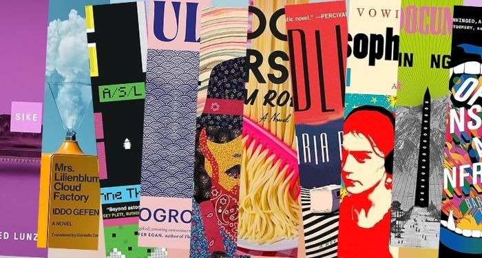
One of the other fun things to notice throughout the year are the trends we see in cover design. In these second quarter books, two trends really stand out. First, there’s a lot of great use of red. Second, there’s a fascinating juxtaposition on a lot of these covers between the natural world and the man-made world.
Find below a number of the most interesting, visually surprising, and best book covers of 2025 from the second quarter of this year. These covers are for adult fiction only, as there are entire posts’ worth of covers for nonfiction, YA, middle grade, and children’s books. I’ve also not included book covers for short story collections, even though those book covers are some of the best of the best in the world of design. Not including them isn’t because I feel like slighting them. It’s because you can check out this roundup of the best book covers for 2025’s new and forthcoming short story collections.
All of the covers featured here are for books published between April 1 and June 30, 2025. I’ve done my best to track down credit. You can and should check out the best book covers from the first quarter of this year, too.
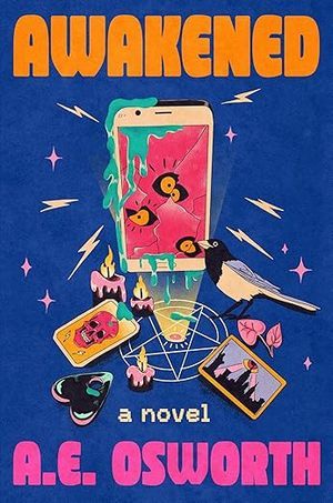 Awakened by A.E. Osworth, Cover designed by Caitlin Sacks, Illustration by Andreea Dumuta
The three main colors on this cover should not complement one another, but that jarring use of dark blue/purple with the bright orange of the title and pink of the authors name work. But the real stars here are all of the summoning goods at the center that are made to look hyperreal with their bold colors.
In many ways, despite looking quite different, this cover reminds me of the vibe of Quan Barry’s We Ride Upon Sticks. It’s fun and it captures the book’s tone well.
 Bad Nature by Ariel Courage, Cover Design by Emily Mahar
The title font here is something I can’t recall having seen on a book cover before, and it gives a bit of a vintage flair, which carries through in the color scheme more broadly. The fat letters and circles for the counters (i.e., the space inside the B, A, D, and Rs) adds a unique weight to the cover that’s nicely paired with the dark red in the lower half of the design.
For a cover that doesn’t have a whole lot going on in terms of imagery, there is a lot of movement in it. When you look at the top of the flower–the part above the red and leaning into the “U” in the title–you can feel the breeze blowing.
 The Dark Maestro by Brendan Slocumb
For a thriller about a classical musician forced into witness protection, the central image here tells nearly the whole story in a simple but evocative way. The color scheme here works well, as does the movement in the lines separating the blue bottom half of the cover and yellow top half of the color.
The design here has an old school feel to it. It’s quite reminiscent of the hardcover design of Colson Whitehead’s Harlem Shuffle. This is likely intentional, since the two books would make pretty good read alikes.
 Endling by Maria Reva
Compare the cover for Endling with that of The Dark Maestro above. The covers are not anywhere near the same, and yet both utilize (and bastardize!) the rule of thirds, breaking the design into three distinct and eye pleasing pieces. Both make the three pieces energetic, though where Maestro does so with smooth lines, Endling goes with rougher ones.
What’s so striking about Endling isn’t just the brilliant red. It’s not just the stripes depicting both sand and movement. It’s the careful juxtaposition of the natural world in all of its sharp edges with the smoothness of the man-made recreational vehicle. The thinly-weighted font for both the title and author name are nicely done, too, allowing the reader enough information to know what they are but they don’t impede on the design itself. If they’d been straight, rather than with a little curve to them, the impact may have been distrcting.
 Food Person by Adam Roberts, Cover Design by Janet Hansen
I’ve waited for months and months to share this cover in a best of roundup. It is easily one of the best book covers I’ve seen in a long time, and that’s because it’s unique–this is a photograph, rather than a graphic or piece of art–and it is a little absurd. Who has not thought about running a red comb through a plate of restaurant spaghetti?
The title and author font, alongside the white starburst used for a blurb, is perfectly befitting an Italian restaurant that would use the kind of red checkered tablecloth in the background.
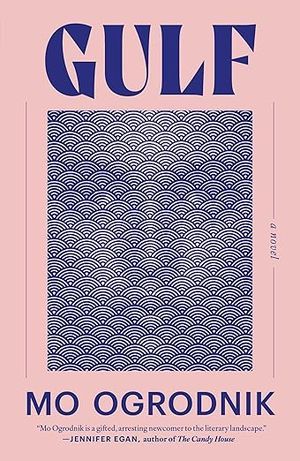 Gulf by Mo Ogrodnik
Gulf may be the least bold cover on here in terms of color palate, but that softness is necessary to heighten the impact of what this cover is doing. Remember those optical illusions from childhood, where you would see either two vases or two faces in the same image? This kind of does that: you can see a serious-looking face in the center and you can see a collage of stacked rainbow-shaped arches. If you let your gaze soften enough, you can see both simultaneously.
Misophonia by Dana Vowinckel, translated by Adrian Nathan West

There’s a very similar structure in Misophonia‘s design when you compare it to Bad Nature, and yet the two covers could not feel nor convey their stories more differently. There is a lot of color going on with this cover, and that busy feel helps readers feel the MOOD of the young person in the center of the image. You don’t need to ask them if they’re happy or angry. You know the answer is going to be that it is none of your damn business.
The neons, the explosions, the stark black headphones against it all: just perfect. Talk about conveying misophonia.
 Mrs. Lilienblum’s Cloud Factory by Iddo Gefen, translated by Daniella Zamir, cover design by Pablo Delcan
A perfectly blue sky meets a bright yellow machine pumping nature full of man-man clouds. Brilliant. It’s BRILLIANT.
 My Documents by Kevin Nguyen
Again, we have a cover utilizing and remixing the rule of thirds. The top of the image in neon green and light pink is your first third. The mountains in the background are your second. The third comes from the black tower of eyes and the land below (the lines from the bottom of that tower separating the ground into three pieces is especially pleasing to the eyes). This is another excellent example of nature meeting the man-made world, too, and it reflects the book’s exploration of internment camps–with the absolutely arbitrary, hate-fueled ideas that people from different backgrounds are somehow not human enough to be granted safety, security, and the freedom to live their lives as anyone in the white majority.
Of Monsters and Mainframes by Barbara Truelove, Cover illustration by Carl Cozier
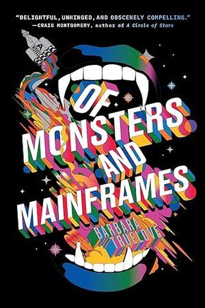
Technicolor space vampire mouth. Delicious!
 Old School Indian by Aaron John Curtis, Cover art by Alex Jacobs
There are not a lot of book covers that make use of a collage style, whether or not they’re truly a collage. That’s part of what makes Old School Indian feel so fresh and so different. We have an incredible array of colors and movement here, from the background, to the orange hanging out behind the “D” in the title (it looks like it’s falling or floating), and the reverse color scheme along the person’s cheeks and chin giving.
Where Bad Nature went with circles for its counters in the title font, note that there simply are not any counters in this one. It works so well, given the collage style. (This is a great cover for folks just learning about or thinking about design’s “rule of thirds” to see where and how it works here–that collage style of foregrounding some things and backgrounding others makes this an excellent example). Bonus: this cover and the lines of the sky draw the eye the way it naturally wants to move across an image by bringing attention from top to bottom in a bit of a reverse 6 motion.
 Sike by Fred Lunzer
M
o
n
o
c
h
r
o
m
e.
Weirdly, this isn’t going to be the only solo image of a couch to make a best covers of 2025 roundup this year. The next one will come later on, but remember this as the one that was very purple.
 Small Ceremonies by Kyle Edwards, Cover design by Kate Sinclair
You know already that this is playing with thirds. You also likely see the same elements that make My Documents work are happening here too–this time, it’s a bright blue river that’s slightly off center. The use of yellow for the title and author are great, but more noteworthy is that the styling is all lowercase. The emphasis being “small.”
The tiger on the left, whose rear body is all that’s visible, offers something that makes this cover just different enough and invites intrigue.
 Smile for the Cameras by Miranda Smith
It’s the blurry technicolor cabin in the style of an old film or television show that does it for this one. There’s really nothing new or innovative in terms of a haunted/scary house story for the cover, but it is just different enough to be memorable and noteworthy. The font choices here are good, too, in adding to that 80s/90s horror feel.
Sour Cherry by Natalia Theodoridou, Cover design by Beth Steidle

Beth Steidle is a favorite designer of mine, and this cover is such a knockout for its simplicity. We’ve got red going on again, but it’s paired with a simple font in pink, and ultimately, the font drives the cover. . .even with what is a disembodied head dangling from the second “R” in cherry. The person’s face is STILL defiant, despite their current, err, circumstances. The cover stands out for all of these elements and the face there’s still a lot of blank space going on.
 The Stalker by Paula Bomer
A hole in the eye for the title? The smarmy look on the face of what is likely the entitled main character from the book? The elements work and do something different than a cover that would simply have this face on it. The space it takes up relative to the cover is also visually arresting.
In some ways, where the title is can be confusing, especially since you see “a novel” at the top corner, followed by the author. But that decision to put the title in an unconventional place really does make you pay attention.
 State Champ by Hilary Plum
There are a lot of different styles clashing on this cover, between the very common font for the author’s name, the graffiti style title font, the hyperrealistic body parts, and the sketched out body parts. But none of those styles seem to be competing. They work in a weird harmony that also perfectly captures what it is to be angry and push back against the systems causing unjust harm to others (it is a book about a woman who works at an abortion clinic and sees this stuff first hand).
 The Wanderer’s Curse by Jennifer Hope Choi, Cover Design by Grace Han
Here’s another really great example of the natural world meeting the human built world in design this quarter. The windows and the door against the giant cloud creates such an intriguing contrast. The thin, barely-there font for both the title and authors name almost get lost in the cloud in a way that works well. A small detail that stands out is that white fence along the bottom of the cover–again emphasizing the human-built world working in opposition to the world around it (even if the goal in an open fence like this is to work in harmony with the landscape).
 Work Nights by Erica Peplin, Cover design by Holly Ovenden
Last but not least, a moment to enjoy a giant pink donut around a technicolor skyscraper and cityscape. The oversized, outstretched white font? Icing. on. top.