
In the past year you will have seen many a big brand lean on nostalgia and heritage rather than radical reinvention. It feels like a retreat from bold and daring reinvention, as we snuggle up to nostalgia like a security blanket
Take the case of the poster child of this new-age caution in Cracker Barrel Old Country Store. In August 2025 the chain attempted to modernise a brand rooted in roadside American. Immediately it saw a tsunami of political and social-media uproar. Soulless … bland … lacking resonance. Not long later, the company quietly dumped the redesign and reinstated its classic 70s-era emblem featuring “Uncle Herschel” beside a barrel. Cracker Barrel serves as a costly lesson in caution, with Cracker Barrel’s market value briefly falling by about $100 million before rebounding when the old design returned.
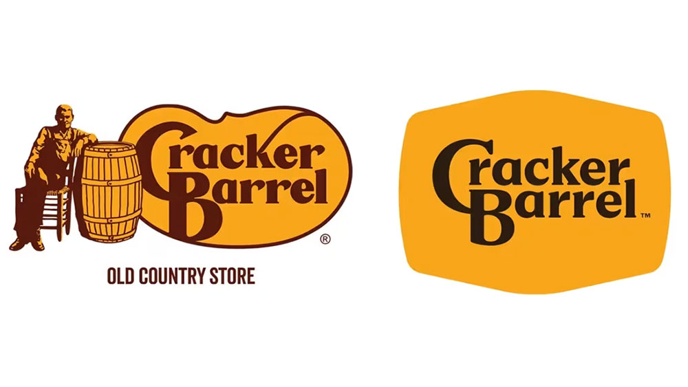
(Image credit: Cracker Barrel)
A similar story has been unfolding at midmarket fashion label Vera Bradley. Long known for its quilted bags in florals and paisley, Vera Bradley launched a brand “refresh” in 2024 aimed at attracting younger buyers. This makeover downplayed the company’s signature prints in favour of solid colours and sleeker lines. But many loyal customers rebelled. By early 2026 the company announced a course correction and its new “Project Sunshine” pivot doubled down on the vintage florals that made the brand famous. The Wall Street Journal reported that Vera Bradley’s executives admitted they had “lost track of what made Vera Bradley special”. The brand reversed its own makeover and leaned into nostalgia, acknowledging that its heritage patterns were, perhaps, core to customer appeal.
You may like
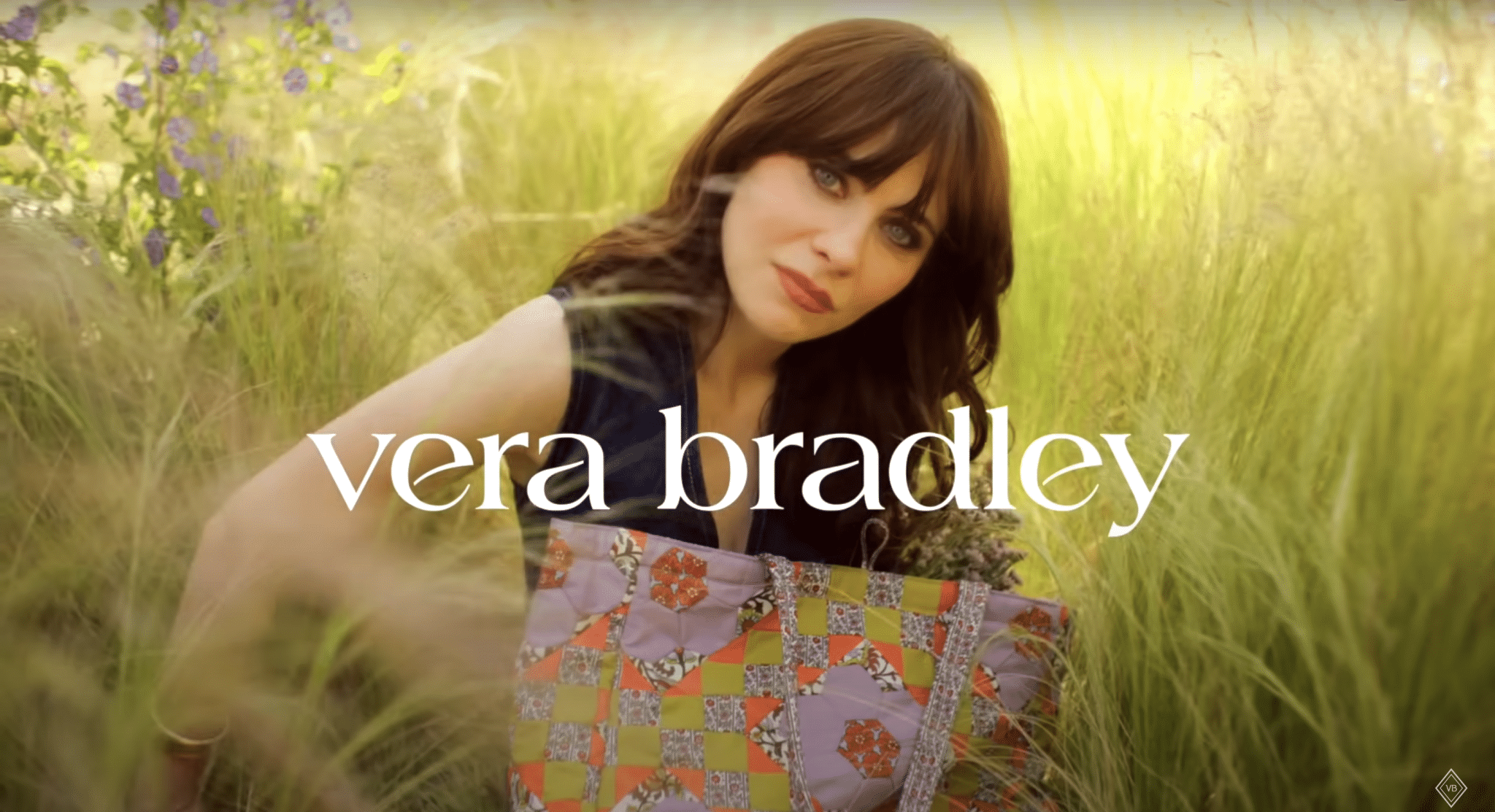
(Image credit: Vera Bradley)
These high-profile U-turns indicate a broader motive. We exist in an age of political upheaval and economic uncertainty, and many companies seem to be betting on familiarity. Designers and marketers note that nostalgia isn’t just sentimentality – it’s a strategic comfort zone.
Brand Genetics, a human centred insight and innovation consultancy, argues that research shows that nostalgic branding provides comfort during uncertain times and this helps consumers feel familiar and trustworthy with a brand. Nostalgia creates continuity between past and present, acting as a psychological anchor for weary customers. Familiar cues, such as old logos, classic patterns act as anchors.
When the world feels unpredictable, a gool old logo and pattern on your breakfast cereal might, on some level, make you feel a little bit safer.
Brands also face a much-more immediate cautionary environment. Social media and 24/7 news cycles mean that even small design changes can spark big reactions, when the name of the game is click bait. A new logo can be framed as a woke political statement, and any misstep is magnified online. In Cracker Barrel’s case, just removing an old cartoon figure became ammunition for a culture war. That kind of instant, vocal feedback encourages companies to play it safe.
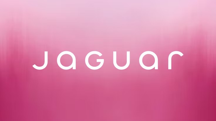
(Image credit: Jaguar)
Think of one of the most radical examples of not playing it safe, Jaguar’s EV pink explosion. Last month The Telegraph reported: “The designer behind Jaguar’s controversial “woke” rebrand has reportedly been dismissed from the carmaker just days after a new chief executive took over…”
Where does all this leave designers? Innovation still matters, but maybe it should be cautioned with authenticity. Be sure change is kept close to the client’s DNA. Strip away at your risk, be mindful around signature elements that customers love – the very things that can alienate the audience a rebrand seeks to excite. Think colours, patterns, characters or typography as an echo to remind people what they already loved.
For many brands, nostalgia has become a safe space to hide from the judgement of a volatile world. For designers, maybe it’s a reminder that rupture without purpose can be a big bang of hot air. So tread carefully, there are landmines in the market.