

To go along with their jersey announcement, the Portland Fire also released a new alternate logo on Wednesday morning.
The new “PDX” carries forward the team’s primary “P” logo, a news release states.

1/5
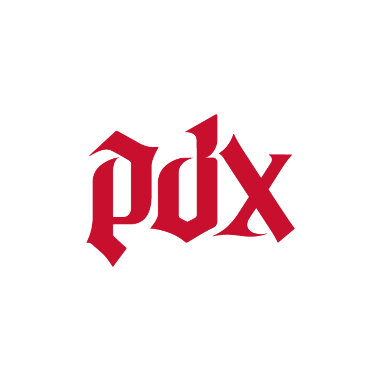
Portland Fire alternate logo
According to the Portland Fire, the stylized “P” includes a tip at the point as a nod to Mt. Hood and the swooshing right side of the “P” is a subtle rose shape.
The rounded space between the “P” and the “D” is meant to reflect the flow of the Willamette River. The bottom of the “D” comes to a point, signifying “PDX as a well-known point of arrival, and the team’s arrival to the market in 2026.”
The “X” mixes a side with a serif with and a side without a serif. The Fire state this is “intentionally designed to celebrate the conviction, pride and individual expression of Portland.”
The new PDX alternate logo did not make its way onto the team’s new jerseys, but it does appear on new team merchandise that dropped on Wednesday morning.