
Developer KDC’s Parkside Uptown tower is planned at Woodall Rodgers Freeway overlooking Klyde Warren Park.
Kohn Pedersen Fox
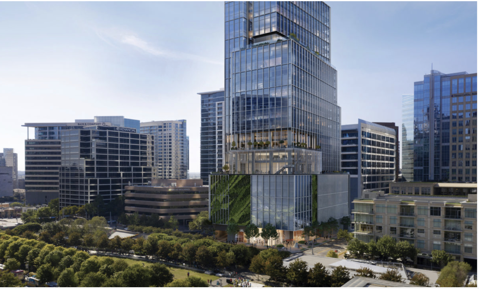
Scrolling through Instagram recently, I came across a group of digitally produced renderings of the proposed Bank of America Tower at Parkside, a stack of offset boxes that will soon rise next to Klyde Warren Park. The post, by the architecture firm Kohn Pedersen Fox (KPF), had more than a thousand likes, and it was easy to see why. The building’s biophilic or “planted” façade and landscaped terraces seemed to fulfill the architects’ promise that the tower would “humanize the office building.”
Maybe it will. But I doubt it will ever look as appealing as it does in those images. Green walls are hard to maintain under the best of circumstances; erecting one that sits in the blazing Texas sun seems like hubristic folly.
Article continues below this ad
I raise the issue not so much to offer a critique of this one project — however warranted that might be — but because it is representative of a broader trend: that the idealized photorealistic renderings served up by architects and developers are increasingly prone to deception, a problem that is only becoming more pervasive with the growing power and accessibility of artificial intelligence. At the same time, the digital tools used to create these images are changing the way buildings are designed, built and marketed to the public.
The June 22, 1947 Dallas Morning News, with presentation drawing of Wright’s Rogers Lacy Hotel.
A dreamy perfectionism
Architectural representation has never been an especially trustworthy medium. Renderings, whether drawn or produced digitally, inevitably present projects to their best advantage, showing them under optimal conditions and from ideal vantage points (typically aerial perspectives available only to pigeons and their winged brethren) with inconvenient and unappealing context removed.
Article continues below this ad
Even when architects are trying to be honest, their images can be hard to interpret. In 1946, for example, a reporter for this paper described Frank Lloyd Wright’s proposal for the 47-story Rogers Lacy Hotel in downtown Dallas as “windowless” because a tinted presentation drawing (produced by Wright’s head draftsman, John H. Howe) made its sheer glass walls look like metal. Oops.
Make Dallas News a preferred source so your search results prioritize writing by actual people, not AI.
Add Preferred Source
Notwithstanding that kind of confusion, there is a significant difference between the drawings architects have used for most of history and today’s digitally powered renderings. Nobody would mistake a handmade drawing for something real. Today’s images, however, conjoin a dreamy perfectionism with a photorealism that makes them especially convincing. “When you’re talking about commercially driven projects, there’s a deep incentive to make them appealing, not just accurate,” says Colin Koop, a partner with Skidmore Owings and Merrill (SOM).
The images of SOM’s Springs District development for Uptown are a good example of the rendering style typical of today, though a better example might be the images, released last year, of the proposed Kay Bailey Hutchison Convention Center remake, which bathed the mammoth structure in a golden glow as if it were delivered straight from heaven.
Article continues below this ad
Rendering of the proposed convention center seen from Lamar Street looking south.
Amplify Dallas/Inspire Dallas
‘It seemed like a miracle’
In the early 1990s, when digital rendering technology began transforming the architectural profession, it was used as a tool more for experimental design than for swishy marketing campaigns.
Among the pioneers of that period was the Los Angeles architect Neil Denari, who created speculative projects with daring forms made possible by modeling software developed to help Hollywood studios make animated films. “The audience has shifted from people talking about the future of image-making to people selling buildings that have to look real to people who are going to put down a few million dollars and want to know exactly what they will get,” Denari says.
Article continues below this ad
Liz Diller and Ricardo Scofidio, founding partners of Diller Scofidio + Renfro, took digital rendering in another direction during that time, creating hybrid images that layered photographs and drawings while retaining a sense of the drawing’s handmade, tactile quality. “The objective today for many architects in making renderings is to be as close to reality as possible,” Diller says. “It wasn’t always that way.”
When photorealistic rendering first became possible, in the mid-1990s, it required a combination of technical ability and high-powered computing that was too specialized and too expensive for most architects to maintain in-house.
Neil Denari, multi-section office block, 1998.
Neil M. Denari/Neil M. Denari Architects
“Computer graphics was in its infancy, but it was clearly going somewhere,” says Matthew Bannister, a partner at DBox, which was founded in 1996 to create renderings for architects. “When we started, there were maybe a handful of people trying to turn this into some kind of business. Now there are thousands of very good firms all creating very convincing work.” That image of KPF’s Parkside tower? It was created by Motiv, a firm based in Poland, a fact that goes some way to explaining how a green wall ends up on a skyscraper in Dallas.
Article continues below this ad
Architectural rendering’s watershed moment came in 2003, with the publication of images of the “Bird’s Nest” stadium for the Beijing Olympics, designed by the Swiss architects Herzog & de Meuron. Those renderings, created by the Paris-based studio Luxigon, showed a dramatically lit stadium that seemed to glow from within. “They were like Caravaggio or Titian paintings,” Bannister says. “It seemed like a miracle.”
Rendering of the Springs District designed by SOM.
Contributed/Skidmore, Owings & Merrill
‘A lot of uncooked ideas’
Architects are now more than capable of producing sophisticated renderings themselves, but they continue to outsource that work to shops like DBox, Motiv and Luxigon because those firms are adept at translating architectural ideas into visuals appropriate for real estate marketing. “The appetite for content is insatiable,” says Bannister, of the demand for images. “Everybody now is sort of trained with their thumb to comb through visuals endlessly.”
Article continues below this ad
Meanwhile, those same digital design tools have remade the way architects work, especially a younger generation of digitally native practitioners. “This is the water they swim in and they don’t understand how much their formal creativity is being driven by the programs themselves,” says Koop, who notes that those programs are now embedded with AI. “I think the influence is enormous on the forms that architects are making.”
The stepped blocks and curvy facades that are so common today are easy to produce in digital modelling programs, which can change textures and remake complex shapes in seconds. To drive through Uptown is to see an entire neighborhood developed as much by computer code as by hand, and with a corresponding loss of humanity.
With AI, professional expertise is no longer required to create realistic renderings — anyone with a computer can conjure up a building with a short textual prompt, for better and worse. The city’s recent open call for ideas for the remaking of City Hall, which asks for “conceptual renderings, diagrams, or site plans,” will almost certainly result in a large number of AI-generated proposals.
Those should be viewed with a healthy dose of skepticism. “What I see are a lot of uncooked ideas that are just surface treatments, without any knowledge of what’s behind that surface,” says Diller, of architecture created with AI.
Article continues below this ad
A rendering of the Donald J Trump Presidential Library. A cross between Trump Tower and Freedom Tower.
Screen capture Donald J Trump Presidential Library/TNS
There could be no better example of this kind of shallow design than the video rendering, released late last month, of Donald Trump’s proposed presidential library, a kitschy, gold-tinted tower that would soar above the Miami skyline.

By signing up, you agree to our Terms Of Use and acknowledge that your information will be used as described in our Privacy Policy.
As has been widely noted, the presentation was clearly created with AI, and like much AI-generated architecture, it looks real but is structurally impossible. While the lobby has what appears to be a full-size Air Force One (which would almost certainly not fit within the building’s envelope), it does not seem to have any structural columns nor a central core for elevators and other mechanical systems.
Article continues below this ad
Given that the video seems intended more for fundraising than demonstrating architectural feasibility, it might be written off as a bit of innocuous exaggeration. Its dubious realism, however, highlights the increasing demand for vigilance when looking at any image of architecture. Or, to put it more bluntly: caveat emptor.