

Late last week we broke some news regarding a planned rebrand coming soon for the Ontario Reign. Now, we can follow up with some additional details and even share a few jersey mock-ups.
From what we’ve been able to gather — and most people in the organization are being very tight-lipped about what’s coming — the overall look will allow the Reign to establish a bit of their own identity, while maintaining strong ties to their relationship with the Kings.
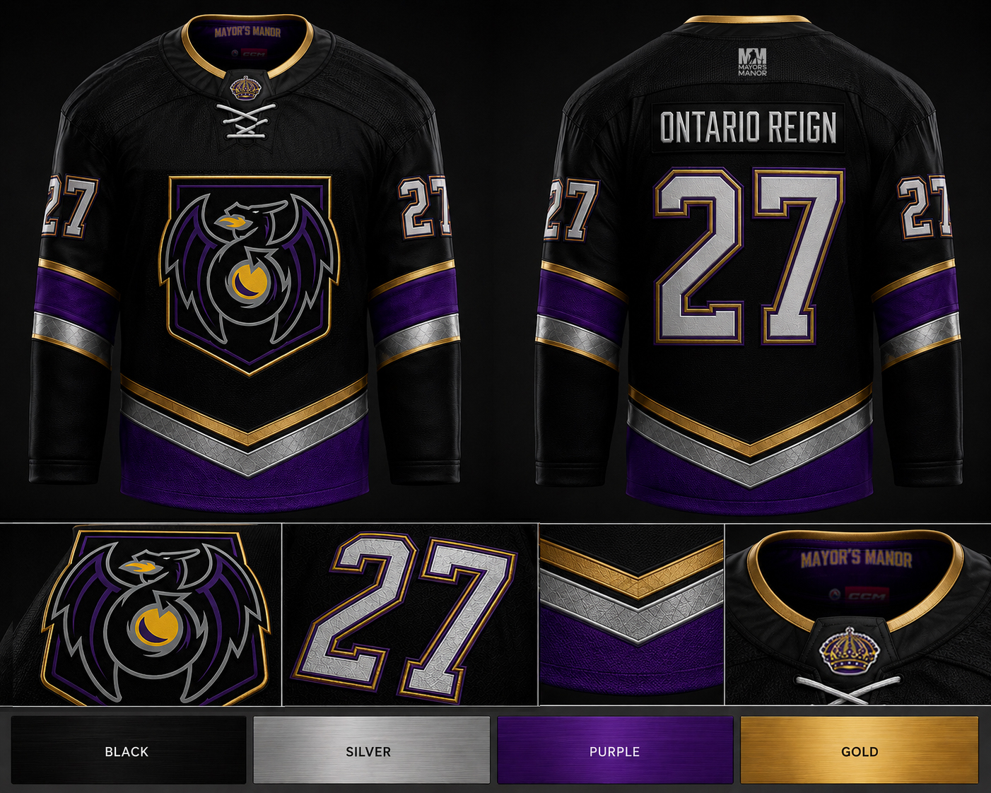
What that means is we’re not convinced the logo will be the one used on the jersey below. We also know there has been a strong push for a few years by a few people inside the Reign front office to go back to the ‘dragon logo’ that was used during their ECHL years. So where it all lands remains to be seen.
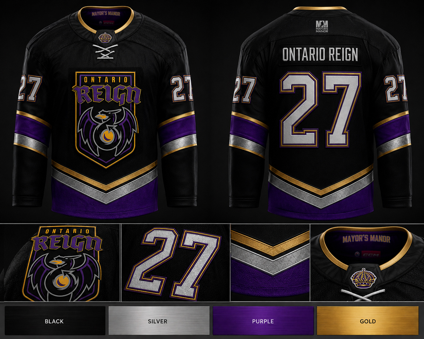
However, all indications are this is going to have sort of a Manchester Monarchs feel to it, where all four colors are incorporated — black, silver, purple, and gold.
In their version, it was on a purple jersey (with a white version available, as well):

For Ontario, we’re expecting the new-look Reign to utilize a black jersey, with colored accents. Something similar to these mock-ups:
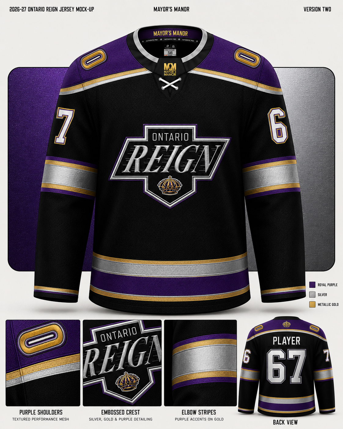
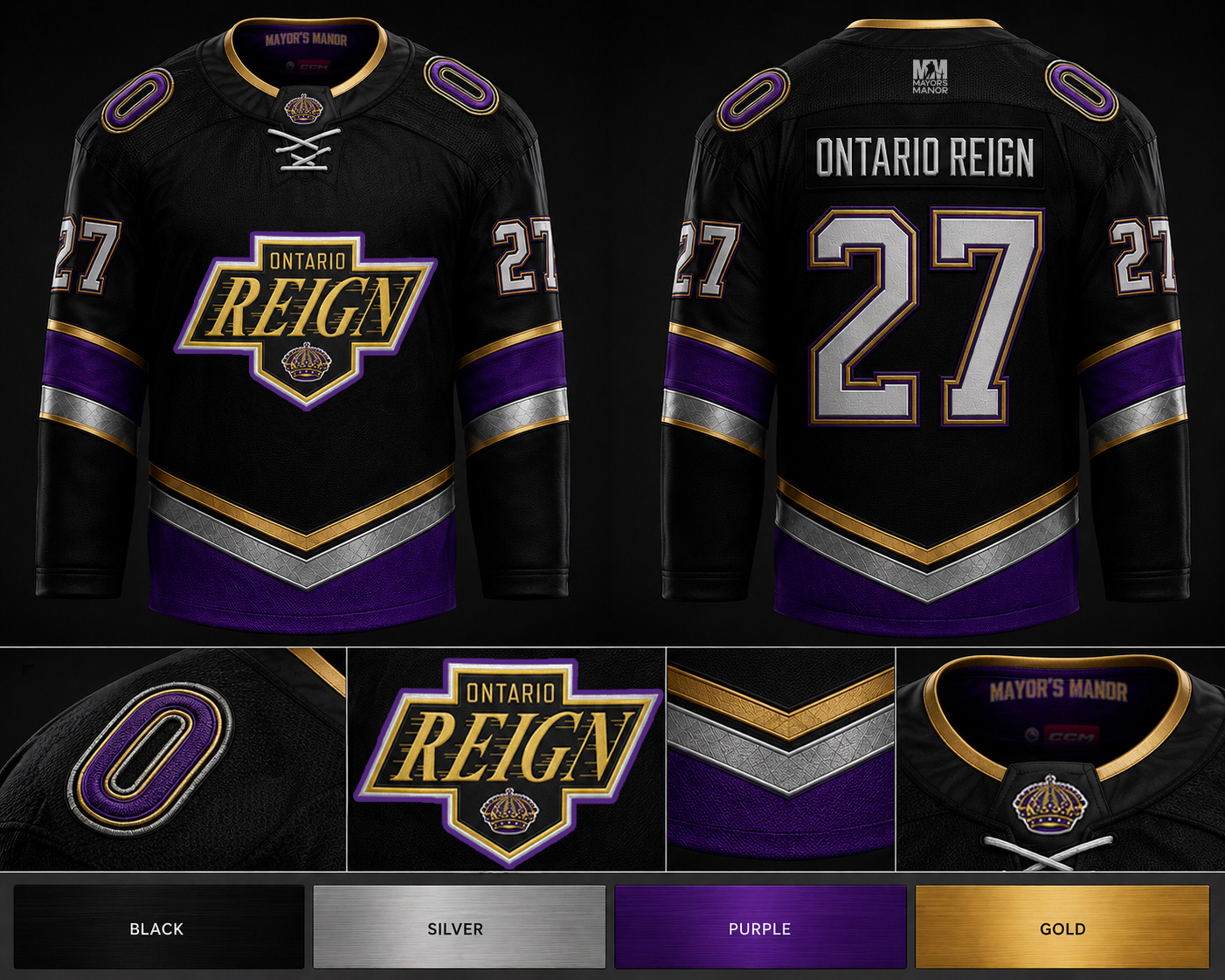
NOTE: Silver will most likely be downplayed on the final jersey. It’s there, but more in a complementary way; similar to how it was used in the Manchester look.
Focused observers likely also spotted the ‘O’ shoulder patch in the mock-up above. That’s not the final treatment, but more for conversation. As noted in our original article, there is expected to be some subtle imagery worked into the jersey design that provides a nod to Ontario, the Inland Empire, or perhaps even Ontario Motor Speedway (which is now the land used for the team’s home arena).
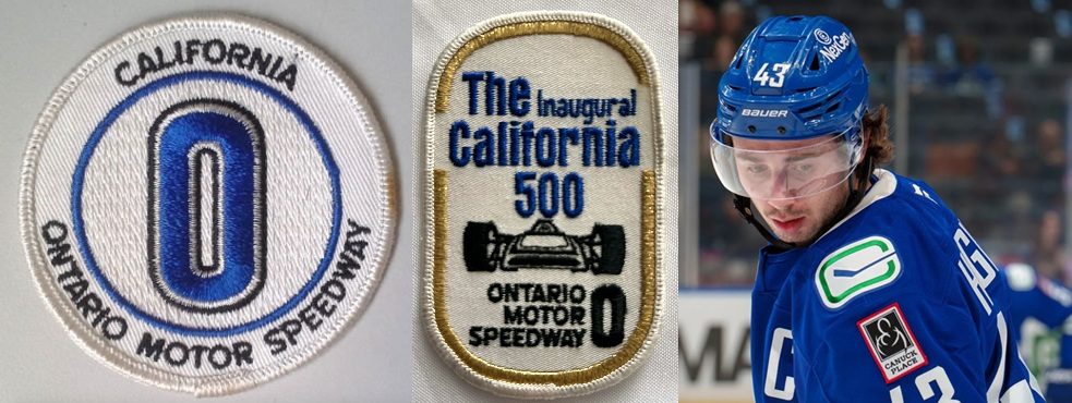
The original OMS logo was meant to represent Ontario and the shape of the track. It would make sense for the Reign to go with something similar… if it wasn’t for the fact that the way it’s presented here it looks too similar to having a zero above the numbers on the sleeve. That would be confusing. Adding in some checkered flags around it could soften things, but we’re not expecting that to be the final treatment.
For additional context, the Canucks photo included was to show how using something similar as a shoulder patch made sense in that case because they were able to tilt the oval on its side.
When the jersey is revealed at the Reign fan fest this coming Saturday, the team will have a pop-up merchandise offering that will feature limited edition items using the new Reign logo and colors.
Bonus Mock-Ups
If the Reign are serious about moving toward a new crest, maybe they’re going a tad old school…
MORE LA KINGS NEWS:
RUMOR: Major Change Coming to Ontario Reign Look for 2026-27 Season
Note to webmasters/reporters: When recapping news or interviews from this site please remember to include a link to www.MayorsManor.com