
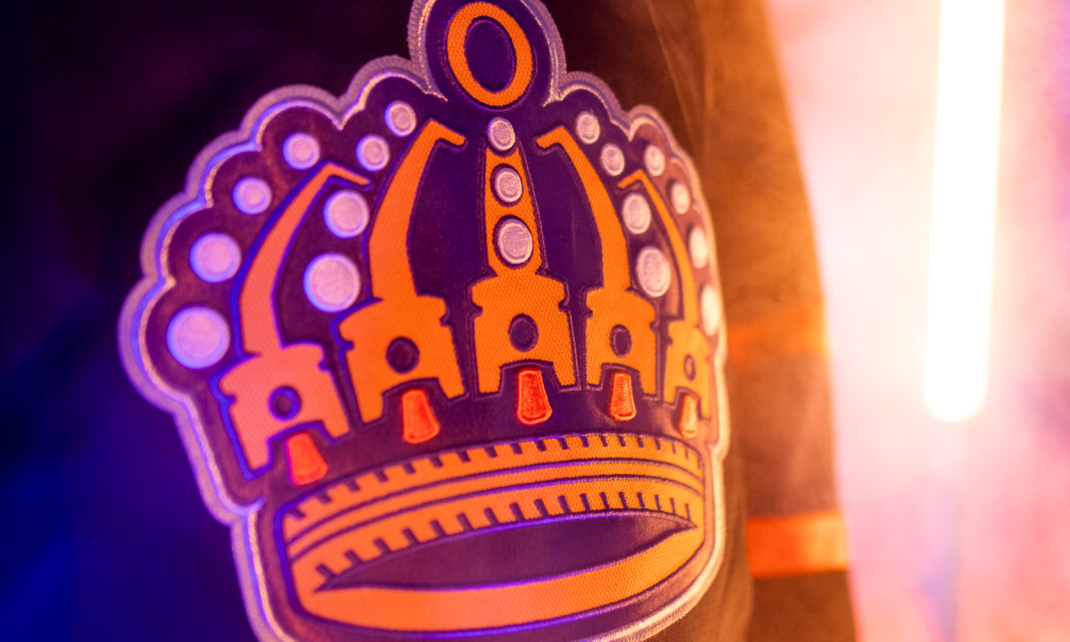
The wait is over.
On Saturday afternoon, the Ontario Reign debuted details surrounding their rebrand. It’s a nod to their past, as well as their affiliation with the LA Kings — and a pinch of the former Ontario Motor Speedway.
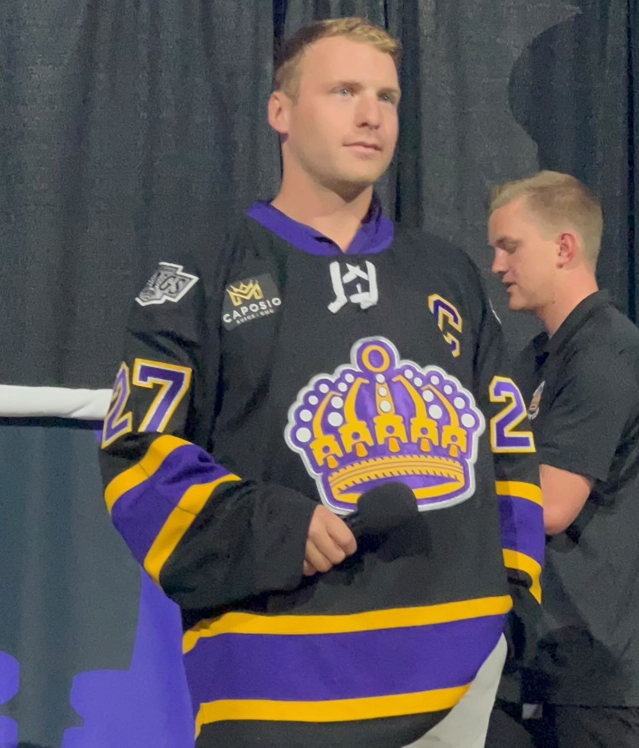
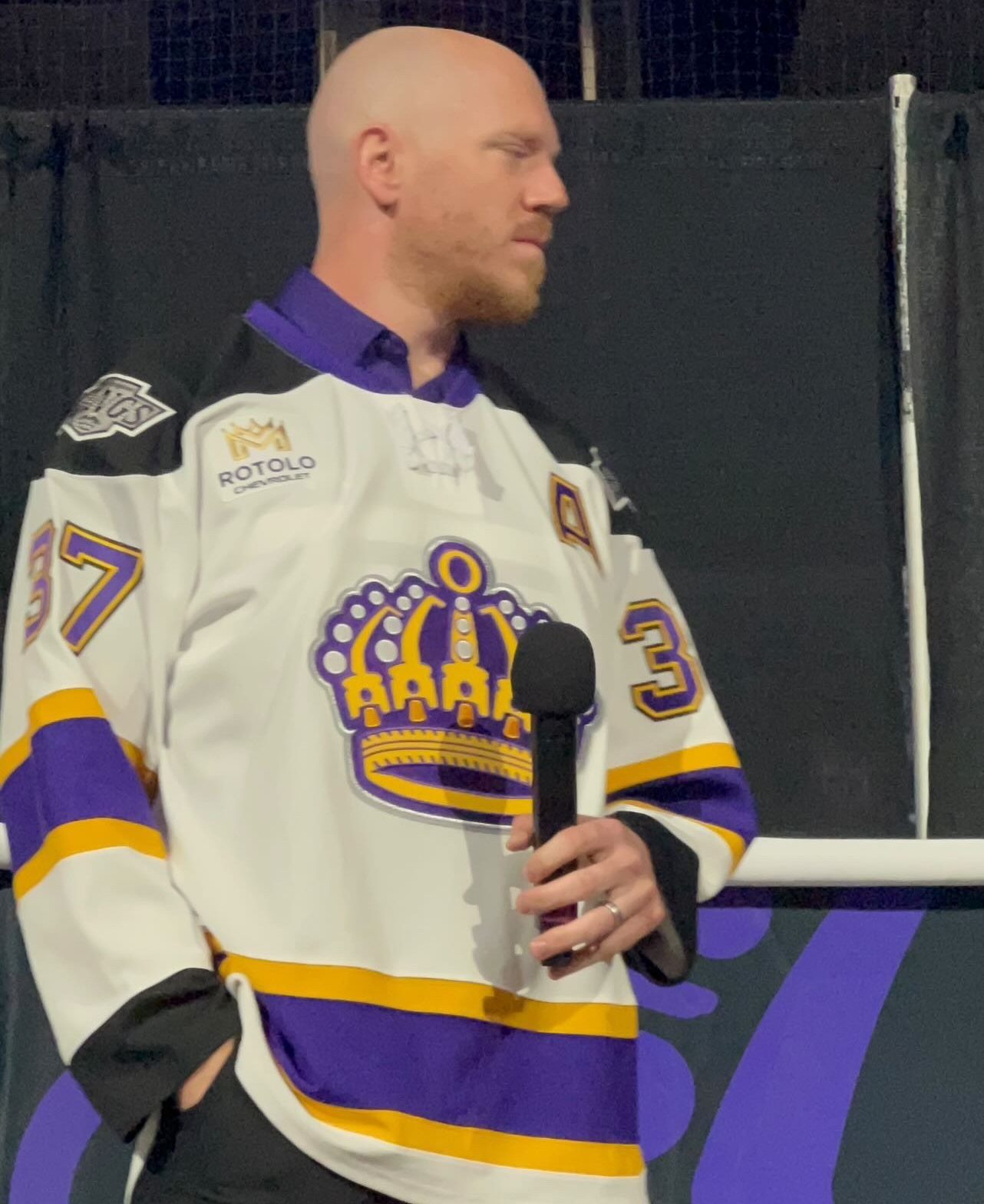
“We are excited to unveil a distinct identity for the Reign that honors our team’s history, celebrates our ties to the Inland Empire community, and maintains a strong connection to our Kings family,” said Ontario Reign Vice President Dan Lynch. “This has been an extensive collaborative process, and we are proud to share it with our fans and community.”
Per the team’s press release — The primary logo pays homage to the Inland Empire and Ontario, while tying the Reign to the LA Kings’ legacy through the crown and royal-inspired elements, including a nod to the Kings original color scheme. At the peak of the crest stands the ‘O’, a reminder that this identity belongs to the people who call it home. At its core, there are five pistons that represent the spirit of Ontario: power, precision, pressure, unity, and relentless forward movement. Beneath it lies the ground it was built on, a mark inspired by the Ontario Motor Speedway, where speed defined the past and motion built a legacy of this land.
MORE LA KINGS NEWS:
Kings Sign Chromiak to One-Year Contract Extension, What’s Next?
Note to webmasters/reporters: When recapping news or interviews from this site please remember to include a link to www.MayorsManor.com