
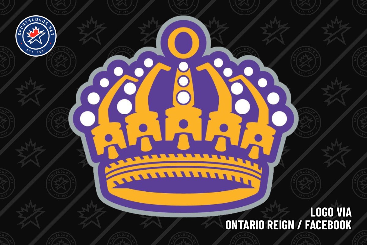
The Ontario Reign are coming for the crown, and they’re letting the rest of the American Hockey League know it with their new primary logo and jerseys.
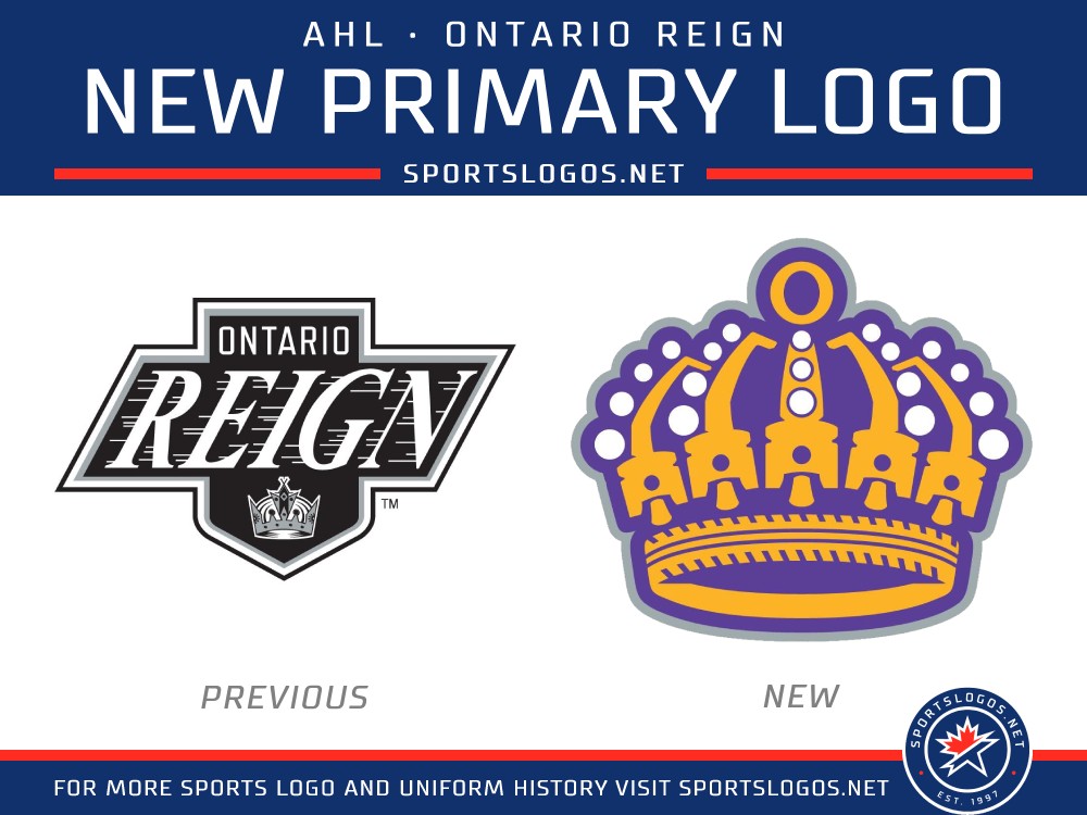
The AHL affiliate of the Los Angeles Kings launched a “full brand evolution” during their Summer Bash event at the Toyota Arena in Ontario, California, on Saturday, June 13. This includes a new primary logo that borrows elements from their parent club’s history along new light and dark jerseys, new wordmarks, a new brand font and an updated colour palette of purple (or “Inland Blue,” as the Reign call it), gold and black.
“We are excited to unveil a distinct identity for the Reign that honors our team’s history, celebrates our ties to the Inland Empire community, and maintains a strong connection to our Kings family. This has been an extensive collaborative process, and we are proud to share it with our fans and community.”
— Dan Lynch, vice president, Ontario Reign
The new primary logo is crown reminiscent of those the Kings have used throughout their history, but with some twists specific to Ontario and the Inland Empire. An “O” sits at the top of the crown, “a reminder that this identity belongs to the people who call it home,” according to the Reign’s press release.
Inspired by Ontario Motor Speedway, auto racing references abound in the logo. Five pistons make up the structure of the crown, representing “the spirit of Ontario: power, precision, pressure, unity, and relentless forward movement.” The base of the crown is an oval with a tire tread pattern along the front.
 Photos courtesy Ontario Reign
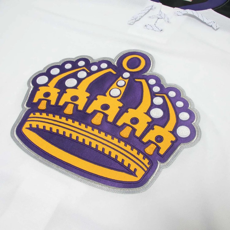
That new logo sits on the front of the Reign’s new white jersey, complimented by purple and gold stripes around the waist and sleeves. The shoulder yoke is black, and the Kings’ primary logo appears as a patch on both shoulders. The collar is purple with white laces at the front. Numbers on the sleeves and back are purple with gold and black outlines.
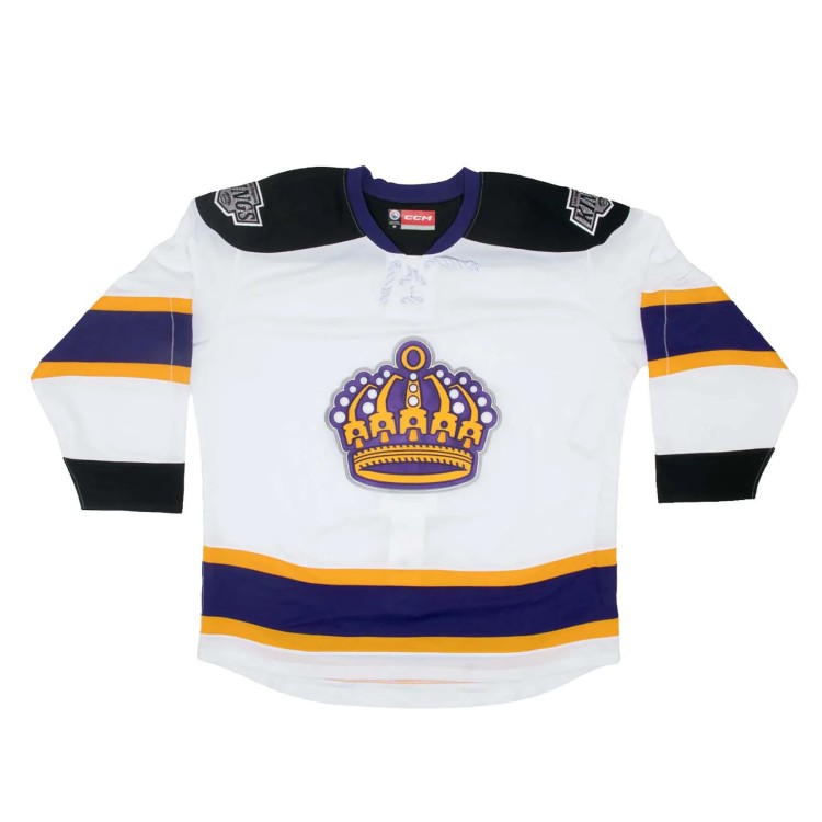
 Photos courtesy Ontario Reign and Ontario Reign / Facebook
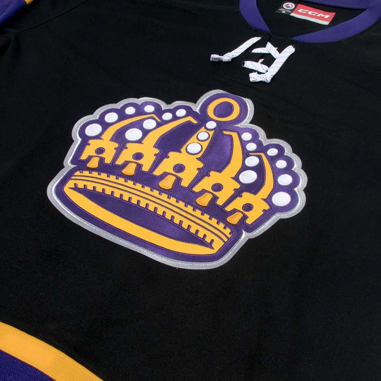
The base of their new dark jersey is black, with the shoulder yoke blending into the rest of the sweater. The crown logo remains front and center, and the same purple and gold stripes run around the sleeves and waist. The numbers are again mainly purple, but this time with white and gold outlines.
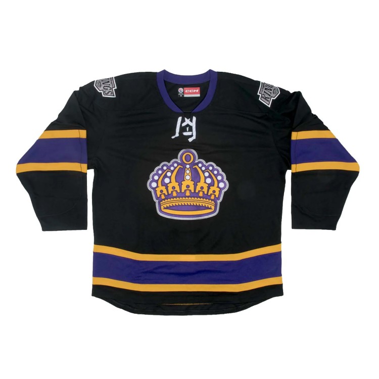
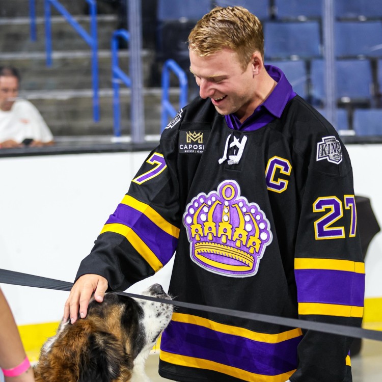 Photos courtesy Ontario Reign and Ontario Reign / Facebook
AHL teams wear dark jerseys at home until the Christmas break, then switch to white jerseys at home until the end of the regular season. They then typically go back to dark jerseys at home for the playoffs.
“We are thrilled with this new brand identity for the Ontario Reign. It certainly aligns with our historic brand as we head into our 60th anniversary season this fall. This really gives the Reign their own identity while setting the stage for some things we have planned this coming season to celebrate our rich history.”
— Luc Robitaille, president, Los Angeles Kings
There was no word in Saturday’s announcement if the team’s “Ontario Rain” alternate identity and its mascot, Sir Cloudieton, would carry forward into the new season.