
HUBARCH COOLS DOWN BAZILIO OPTICS BOUTIQUE
For Bazilio Optics Boutique, Hubarch works with a restrained palette of pale blue and white, then interrupts it with a single flash of red. Set on the ground floor of a residential building, the 100-square-meter store occupies a raw, open shell framed by two oversized windows and a glazed entrance. The existing openness gave the studio a useful starting point: plenty of morning light, few spatial obstacles, and room to give the optics brand an architectural identity of its own.
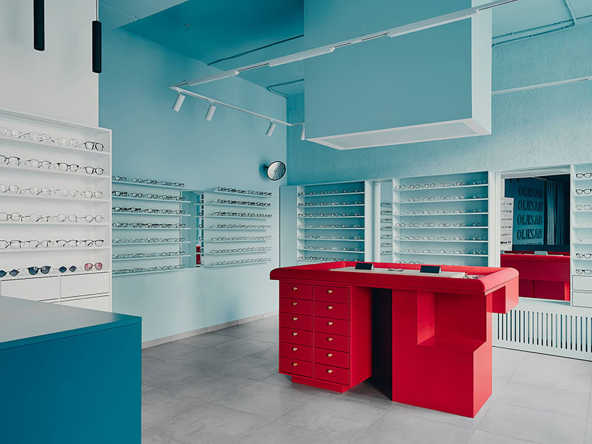
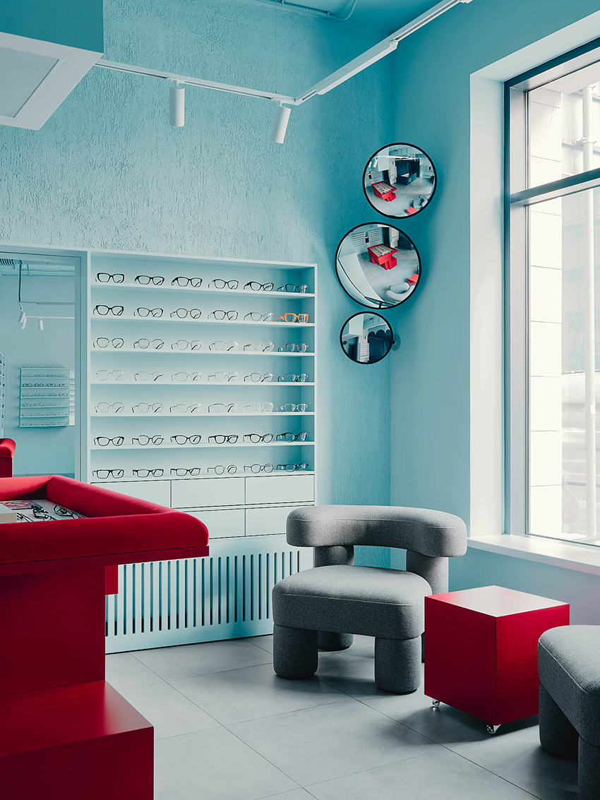
Rather than filling the interior with competing gestures, the design keeps almost everything deliberately quiet. Pale blues wash across walls and textured plaster, while the exposed concrete ceiling is lacquered and left visible overhead. Minimal display units recede into the background, allowing rows of eyewear to read clearly against the cool-toned surfaces. The effect sits somewhere between clinical precision and domestic calm — appropriate, perhaps, for a space devoted to seeing things more clearly.

all images by Dmitry Suvorov | courtesy of Hubarch
A RED COUNTER BREAKS THE BLUE
At the center of this controlled palette, a custom red counter introduces the project’s only major chromatic interruption. Designed and produced according to the studio’s drawings, the piece cuts through the otherwise cool interior with a saturated point of warmth. Its angled shelving takes cues from the balconies of the surrounding residential architecture in Saint Petersburg, translating an element of the city outside into the store at furniture scale.
The counter is not simply there to look photogenic, although it manages that rather efficiently. Its upholstered upper surface adds tactility to an otherwise hard-edged environment, while the structure accommodates fittings, consultations and purchases, making it both the visual anchor and working core of the boutique. Instead of spreading color throughout the space, Hubarch concentrates it in one object, allowing the contrast to do considerably more work with considerably less paint.
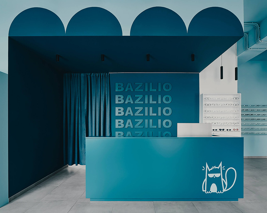
pale blue tones define the optics boutique interior
DAYLIGHT SHAPES THE 100-SQM RETAIL INTERIOR
Behind the main retail area, the studio arranges the more functional spaces — an optometrist’s office, lens-fitting workshop, staff room and restroom — in a compact strip along the rear wall. This organization keeps the storefront open and allows daylight from the two large windows to travel deep into the customer-facing area. The plan remains visually straightforward, with the technical functions tucked away without fragmenting the principal volume.
Material choices are similarly economical. Painted surfaces and textured plaster sit alongside exposed concrete and Italon porcelain tiles, responding to a limited budget and construction timeline without turning austerity into the main event. Instead, the project directs its attention toward proportion, daylight and bespoke furniture. The finished boutique is defined by a simple visual equation: a cool-toned shell, restrained displays and one conspicuously red object holding everything together.
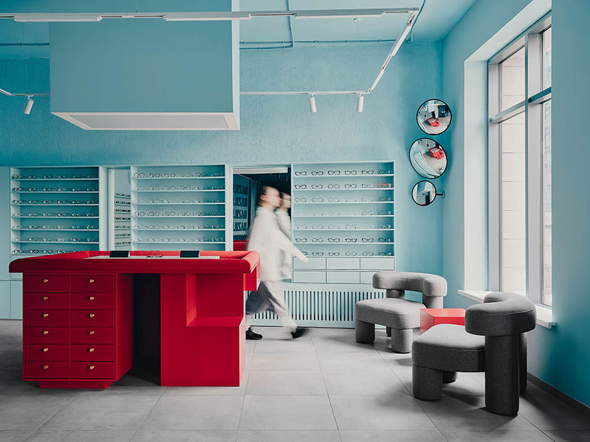
a custom red counter anchors the retail space
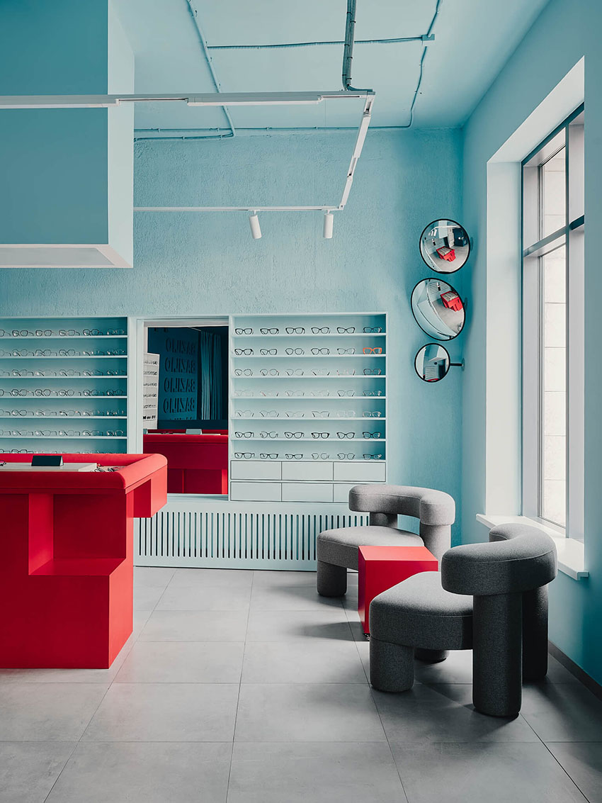
minimal displays keep attention on the eyewear
daylight enters through the oversized storefront windows