
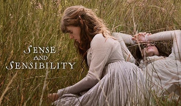
We previewed it, and we actually went to the theater to watch the new Sense and Sensibility (2026). Our collective opinion is that this isn’t the worst Jane Austen adaption, but it’s clearly not the best either. We have a podcast with our raw impressions right after seeing the flick (link below), and here’s the highlights of our observations…
The Costumes in Sense and Sensibility (2026)
This film is set between between 1795 to 1799, according to costume designer Grace Snell, and the gowns really nail that silhouette.
 Edgar & Elinor. Photo by Szilveszter Mako / Vogue.
 Margaret. Photo by Alex Bailey/Focus Features.
Note that because this film is still in theaters, we can’t get a lot of screencaps. But promo images show the high waist, fullness gathered to the back, trademarks of this period, it’s all there, like these extant examples:
 1797-1805 – Gown, Great Britain, Victoria & Albert Museum.
 c. 1787 – Robe en chemise worn by Madame Oberkampf, Musée de la Toile de Jouy.
There’s also a few gowns that appear to be in the chemise à la reine style:
 Marianne.
Compare with these iconic gowns:
 1783-90 – Dress (Chemise à la Reine), Manchester Galleries.
 1783 – Marie Antoinette by Élisabeth Louise Vigée Le Brun, Hessian House Foundation.
We particularly loved Mrs. Jennings’ wardrobe, which featured many of the Turkish-inspired robes/overrobes popular in the period. Sadly the only still we have so far of these is further down, so I’ll include Marianne’s one short-sleeved, cut away overrobe that SCREAMS Turkish (check out Kendra’s book Dressing à la Turque to learn more!):
 Screenshotted from this video featurette on the costumes.
Compare with one from a contemporary fashion plate:
 1794 – Robe à la turque, Gallery of Fashion, Bunka Gakuen Library.
We also spotted several extant garment reproductions, like Willoughby’s amazing spangle-embroidered waistcoat:
 From that same video.
The original is in the John Bright collection, which makes sense because he assisted in the costume design/making:
 1790s – Waistcoat, John Bright Collection.
There were even some hats, which the costume designer noted in an interview with Vogue:
“It’s not that she [director Georgia Oakley] didn’t like bonnets — it was that there had to be more than bonnets in this world. So then our milliner, the dress historian and I tried to find alternatives. We came up with mourning caps, and the cap hood that Elinor has.”
While Kendra derided these caps in her preview, hat-obsessive Trystan found them to be well-made and fitting the period.
 Mrs. Dashwood | Margaret.
It is a bit odd that both Mrs. Dashwood and Mrs. Jennings wear calashes — this type of structured hood was created in the 1760s to protect high hairstyles (and came back in fashion during the 19th century when hair got big again). Neither women have big hair at all, so the calashes seem like a waste.
 Mrs. Dashwood.
The Color Palette of Sense and Sensibility (2026)
While we generally liked the costumes, we were NOT thrilled by the drab colors used for the Dashwoods and really the entire movie. In Vogue, Grace Snell said:
“The clothes were designed in chapters. The Norland chapter is our grief chapter — that’s where we had shades of black, which we achieved with our natural dyeing processes. I didn’t ever want to have true black — I wanted a varied palette. Then, our Barton chapter is a bit warmer in tone, there’s more colour coming in. And then our London chapter is more monochromatic – navies, browns, greys, and for the ball in particular, all whites, so that it does feel quite sparse and has a contrast to Barton, which has a bit more life to it.”
Also in a livestream interview at the V&A Museum, Snell talked about using natural dyes as much as possible for the costumes.
 The costume designer’s natural-dye color samples.
But as we’ve pointed out before, “natural” dyes doesn’t mean drab, muddy colors only! All dyes before the 1850s were made from natural ingredients, and plenty of pre-1850s clothes were in bright, clear tones.
 Sally Pointer’s yarn samples dyed with woad, weld, & madder.
Bright colors show up still in extant garments:
 1790-1815- Jacket, Centre de Documentacio i Museu Textil.
And in period imagery:
 1790 – The Squire’s Door by George Morland at the Yale Center for British Art.
What this movie shows is just dull.
 Mrs. Dashwood, Margaret, & Elinor. Photo via Focus Features.
In the Vogue interview, the costume designer said:
“A lot of her [director Georgia Oakley] references were from working-class Victorian and Regency England. When we saw the set for Barton Cottage … it’s gorgeous but it’s small and falling down. And that helped in thinking about money — how much money could they live on and what could they afford clothing-wise? There was a focus on practical clothing and not being too clean.”
Except there are plenty of scenes of the Dashwoods doing laundry/hanging up laundry, and getting whites very white was a priority in this (and most!) eras, so the dingy quality of their clothes is inaccurate and unattractive.
The one exception is Mrs. Jennings, who gets to wear a little bit of color in her wardrobe. Sure, she’s an extremely chatty, extroverted character and has a more wealth than the Dashwoods, but they’re of the same social class.
 Mrs. Jennings. Photo by Alex Bailey/Focus Features.
Of course, the costume designer’s “vision” for this movie was to make the characters “relatable” — and drab colors without much detail have been in popular modern fashion for decades now. Grace Snell told Country and Town House:
“I was trying to break down some of the laws that we associate with Austen’s work — that we have already seen onscreen — and try to give our audience a new angle to shape the material. I also wanted us to be able to see ourselves or our friends in these characters quite plainly. You know, things are more open and garments are put together in not the most coherent way. It’s almost self-styled, which I think is much more natural. I wanted to bring an audience into Austen’s world, approach it in a different way, and make us all fall in love with her work again.”
The Hair in Sense and Sensibility (2026)
Some on the internets are claiming that long, unstyled hair worn by the Dashwood sisters, especially Marianne, is an accurate representation of the romantic ideals espoused by Jean-Jacques Rousseau at this time period. Well maybe, but even that “romantic” hairstyle was still curled and arranged in this era, not just hanging wild and unkempt.
 Marianne. Photo by Alex Bailey/Focus Features.
Yes, hairstyles of this time period could be loose, soft, and curly with some of it hanging down. But these images all show styled hair:
 1786-1800 – English women’s hairstyles (all culled from Wikimedia Commons).
What the movie may have tried for does not look like what was worn by “romantic” ladies in the 1790s:
 c. 1791 – Georgiana, Duchess of Devonshire, with Lady Elizabeth Foster by Jean-Urbain Guérin, The Wallace Collection.
 1795 – Portrait of the Frankland Sisters by John Hoppner, National Gallery of Art.
And even though YOUNG girls (which, yes, the two elder sisters ARE teenagers and Margaret is pre-teen or just barely a teen) could and did wear their hair entirely “down,” there was generally an attempt at some kind of curl.
 c. 1790 – Portrait of a girl by William Beechey, Yale Center for British Art.
These are just the highlights of our thoughts about the movie — check out our podcast for more!
Sense and Sensibility (2026) Podcast
Listen to our podcast recap of the episode here or on iTunes!
Podcast: Play in new window | Download (Duration: 35:38 — 32.6MB)
Subscribe: RSS
More Frock Flicks
Post navigation