
Once upon a time, football crests were sacred. They weren’t “logos” at all. They were heirlooms, passed down like pocket watches, stitched into kits, carved into memory, it’s safe to say for many it was as if it was tattooed into the skin (both figuratively and literally).
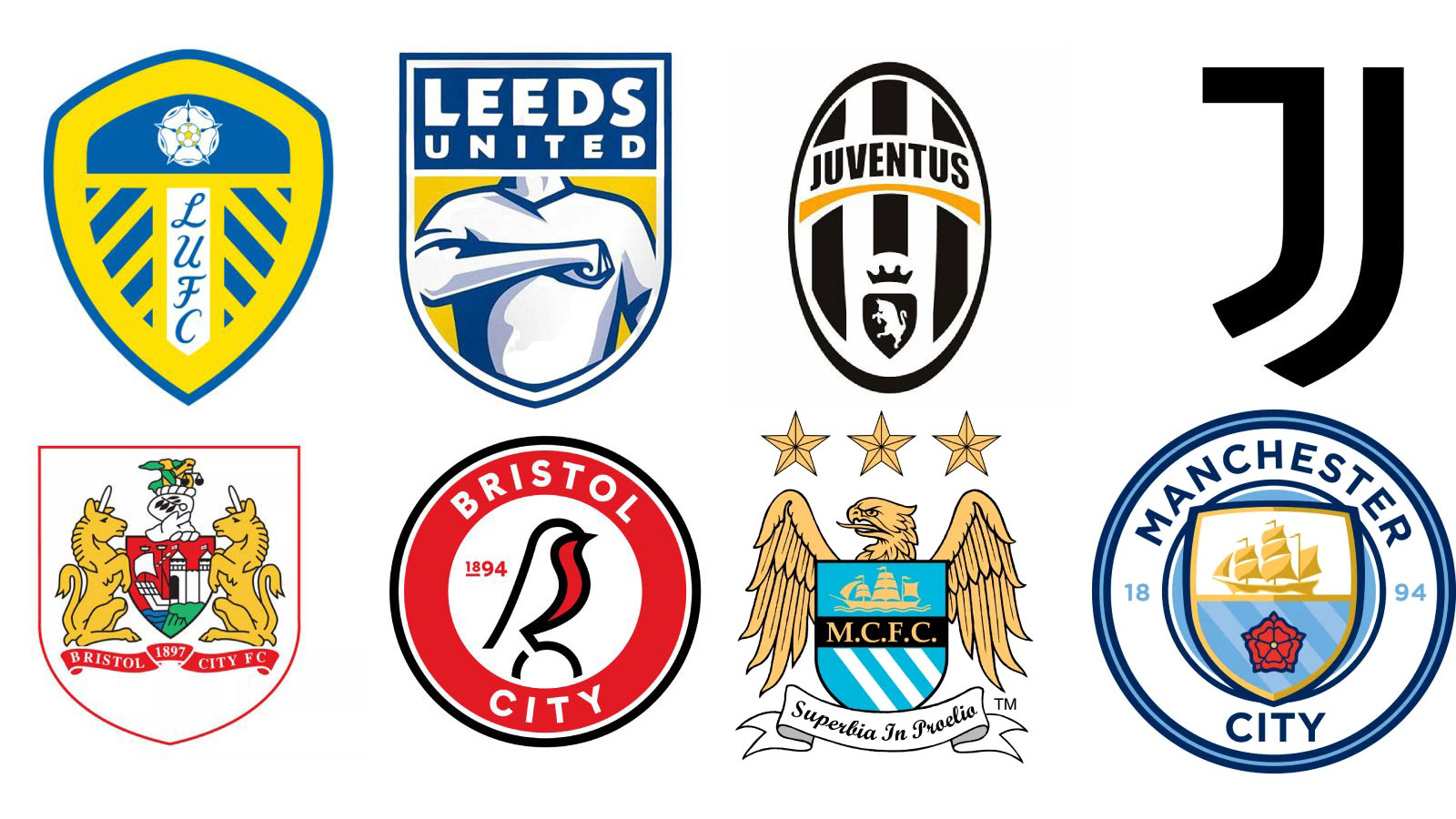
Juventus had its ornate oval with black-and-white stripes. Leeds had the white rose of Yorkshire. Even the smallest grassroots club clung to some medieval-looking shield. Indeed, many of the best football logos are seeped in history.
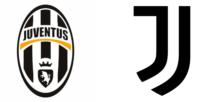
Old (left) vs new (right) (Image credit: Juventus FC)
Then modern branding showed up. And modern branding doesn’t really do sacred. It does streamlined. It does merch-friendly. It does the kind of logo that works on a TikTok profile pic.
You may like
The shift hit headlines in 2017 when Juventus detonated its history for a minimalist “J.” The idea? Transform the club into a global lifestyle brand overnight. The new mark looked great on sneakers, less so on the chests of lifelong supporters. It sparked a debate that still hasn’t cooled: should football clubs act like lifestyle brands?
“Football crests aren’t just identifiers, they’re emotional anchors,” says Dave Ellams, Creative Director at Conran Design Group. “And if you treat crests (and clubs) like lifestyle brands in the hope of attracting new audiences, you risk stripping away the story. In designing for customers, you risk alienating the fans.”
Ellams has seen this movie before. “Jaguar faced a backlash when it sidelined its own brand heritage (the iconic leaping cat) in favour of a cleaner wordmark; when Burberry did something similar, it ended up reintroducing heritage elements after years of minimalism.”
The Redesign Winners and Trainwrecks
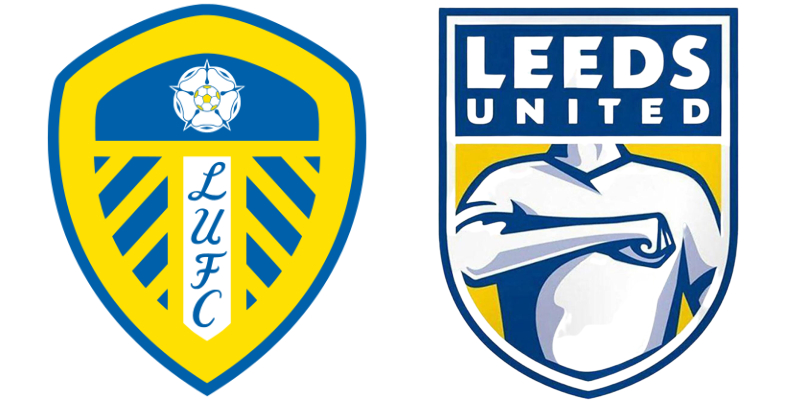
(Image credit: Leeds United FC)Juventus (2017): Dropped the stripes and shield for two lines forming a “J.” Globally stylish, but studies show fans still hate it eight years later.Leeds United (2018): Spent six months consulting 10,000 people, then revealed a crest featuring a stylised “Leeds salute” instead of the rose. The internet torched it within hours. Sixty thousand signed a petition. The club binned it in six days. The daddy of logo trainwrecks.Eastleigh FC (2020): Went the other way. The Hampshire side leaned into its WWII heritage with a new badge featuring a Spitfire and “1946,” after nine months of fan workshops. Fans loved it. Proof you can change a crest without killing the soul.Ajax (2024): Bucked the minimal trend entirely, replacing its 1990s line-art head with a detailed portrait straight out of 1928. Fans swooned. It was like watching a heritage brand put its crown jewels back on.Everton (2013): Tweaked its shield to “simplify” it for merch, ditching laurel wreaths and the Latin motto. Sixteen thousand signatures later, the club promised to fix it.
Redesigns aren’t just aesthetic choices; they’re cultural battlegrounds. Fans see crests as identity. Boardrooms see them as brand assets. Modern marketing pushes clubs toward flat, circular designs and sans-serif typography, easy to reproduce, easy to sell. But every removed motto, every simplified symbol is a piece of the club’s story gone missing.
The emotional fallout is predictable. Nostalgia isn’t just a vibe; it’s a trust signal. It really does mean something to the fan. A familiar badge reassures you that the club is still your club, even if the players, owners, and kit sponsors change.
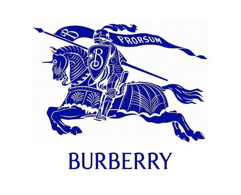
Brands like Burberry have been leaning into their heritage lately by resurrecting old visual assets (Image credit: Burberry)
Ellams says clubs should apply a simple rule: “Fans should come first. The club’s ethos and history is literally passed down through generations, giving you lifetimes of loyalty to tap into. The modernisation of design is inevitable, but clubs should test both new and heritage-inspired versions of crests with fans to protect that all-important emotional investment.”
Outside of sport, plenty of brands have learned the hard way that minimalism can erase meaning. The corporate world is now deep into a nostalgia rebound. Think Pepsi quietly reintroducing its 1980s globe. Think Burberry reviving its equestrian knight.
In sport, this same nostalgia sells retro kits in droves and fills stadiums for “heritage” match days. It’s why Ajax’s detailed revival landed so well: it didn’t just look good; it felt right.
Crisis or Evolution?
So, is football in a “logo crisis”? Maybe it’s less crisis and more growing pains. Clubs are wrestling with two opposing forces: the need to look modern, global, and marketable and the need to look like themselves.
Some will get it wrong. Some will get it right. Most will keep trying to thread the needle: updating the brand without losing the badge’s emotional DNA.
The stakes are high. A football crest is more than pixels on a screen; it’s a portable piece of home. And while the game itself can change (think new owners, new leagues, new revenue streams) the badge is the one thing fans don’t want rebranded like a sneaker drop.
History, hype, heritage, and hashtag campaigns will keep colliding. And every time a club goes for a “radical refresh,” the question will hang in the air: are you modernising, or are you erasing?