
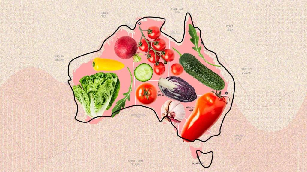
Last week the ABS published mind-blowing new data on who eats what and where in Australia. Now, for the first time, we can map the consumption of vegetables across the country.
You can post your lunch on Facebook, but the data doesn’t lie: some of you wouldn’t recognise a broccolini if it whacked you in the face.
Here’s a map of the country by veggie consumption (apologies to areas with missing data, especially Tasmania). What it shows is that vegetable consumption varies most inside our cities, with the outer suburbs eating less and the inner burbs making very good friends with salad.